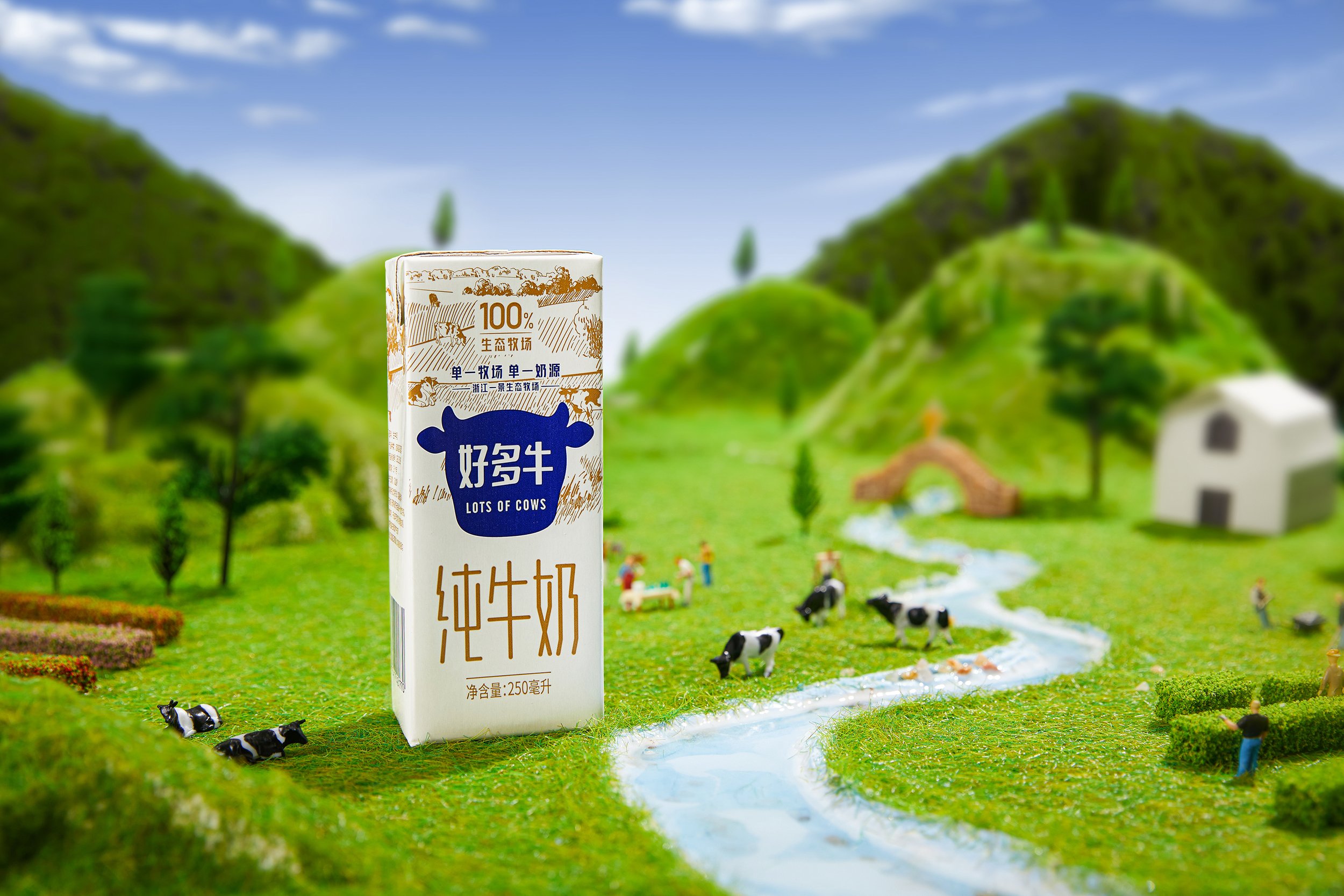
一景乳业作为传统企业想要拓展产品形式与边界,越是“老字号” 越是从细节到整体的每一步都有着大量思考和推敲。设计即要表达产品本身的质朴概念,还要符合市场需求,两个思考间的相互对撞与激发,往往能带来更为成熟的产品表达与设计策略。
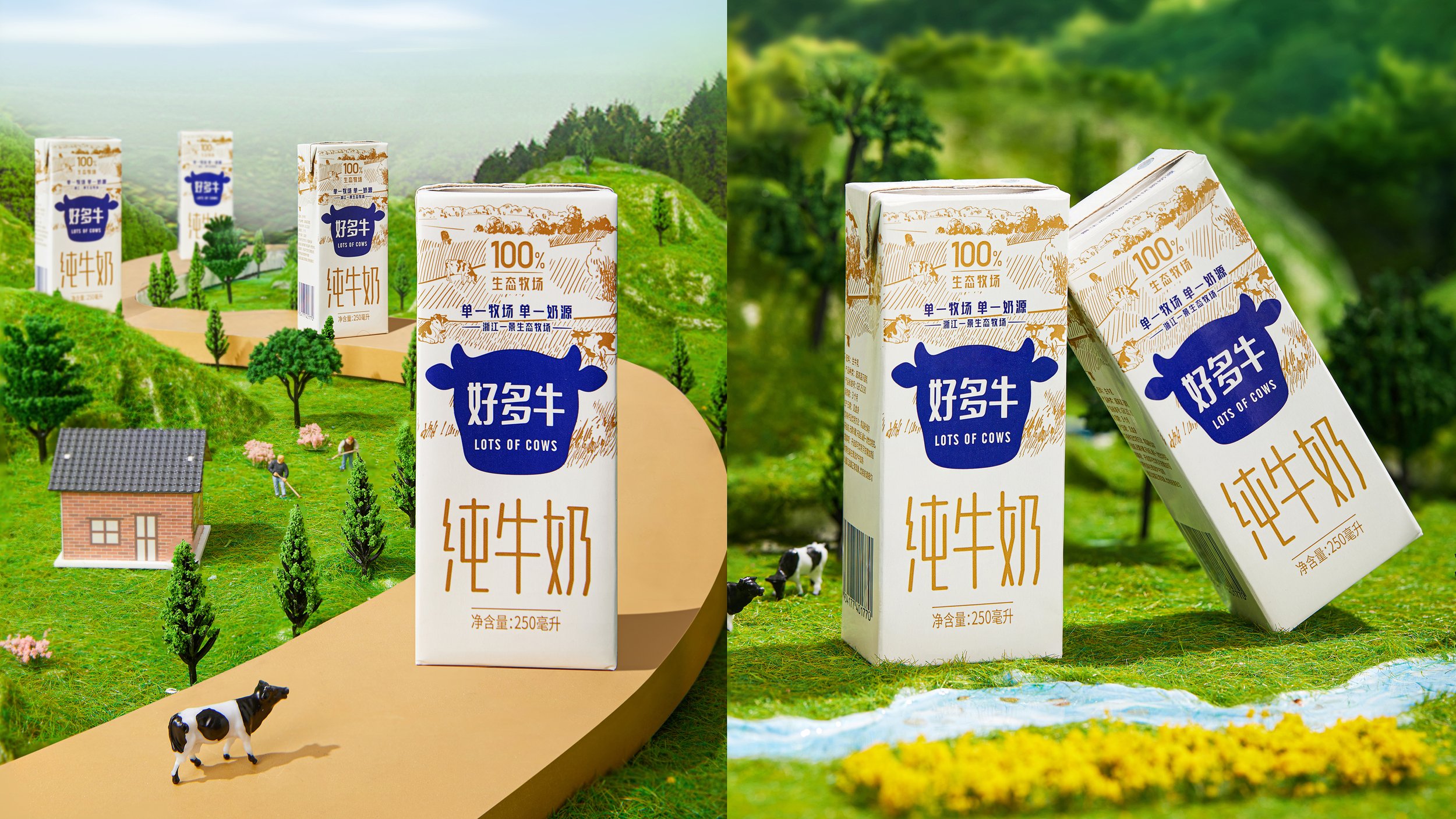
通过深入沟通与挖掘,我们认为好多牛品牌无需标新立异,特立独行。 只做一件事,是说一句话。 “单一牧场,单一奶源”就是浙江一景牧场最为核心的产品优势,任何大 品牌都不具备的奶源特征,这也标志着高质量的奶源把控。
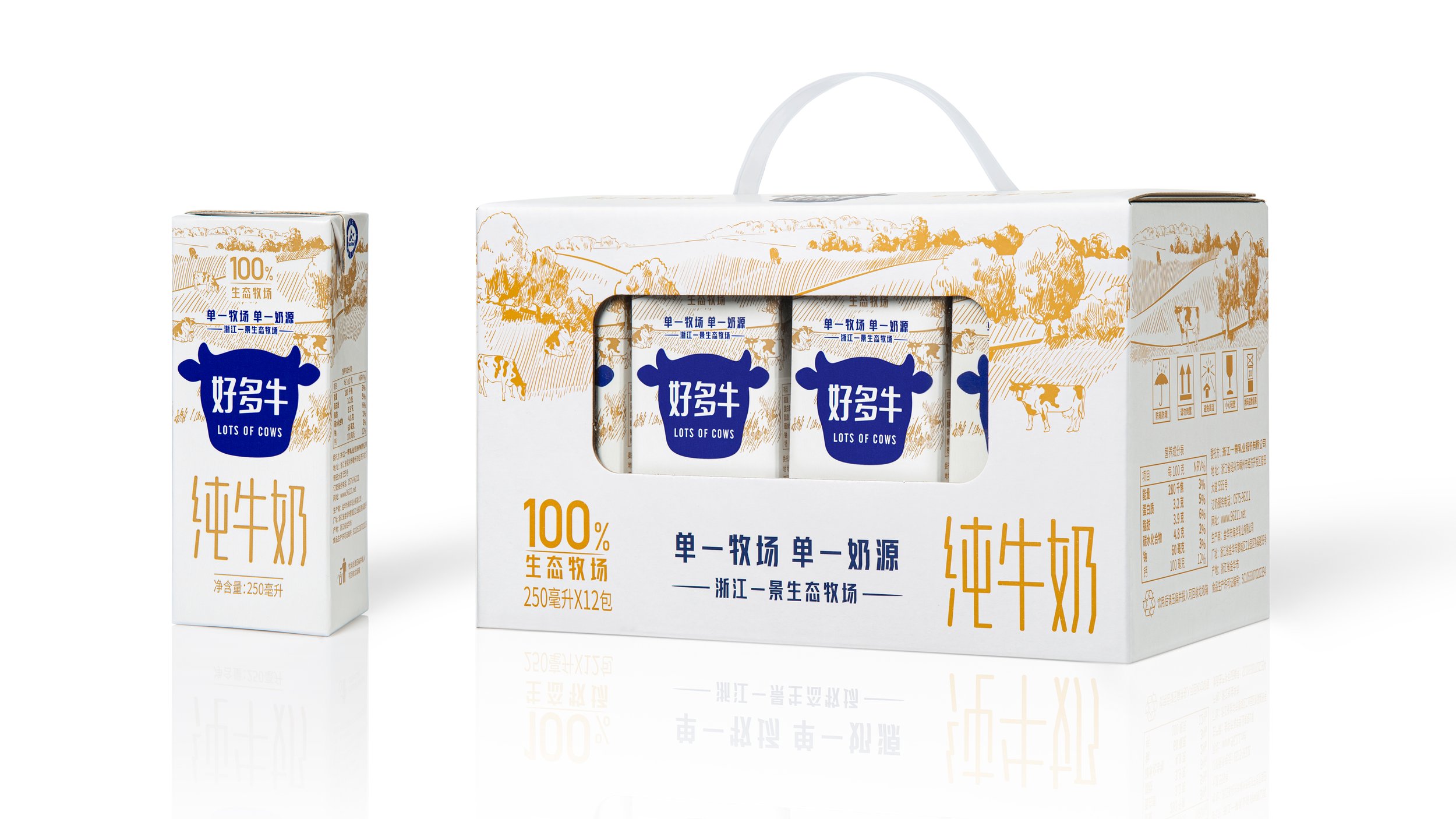
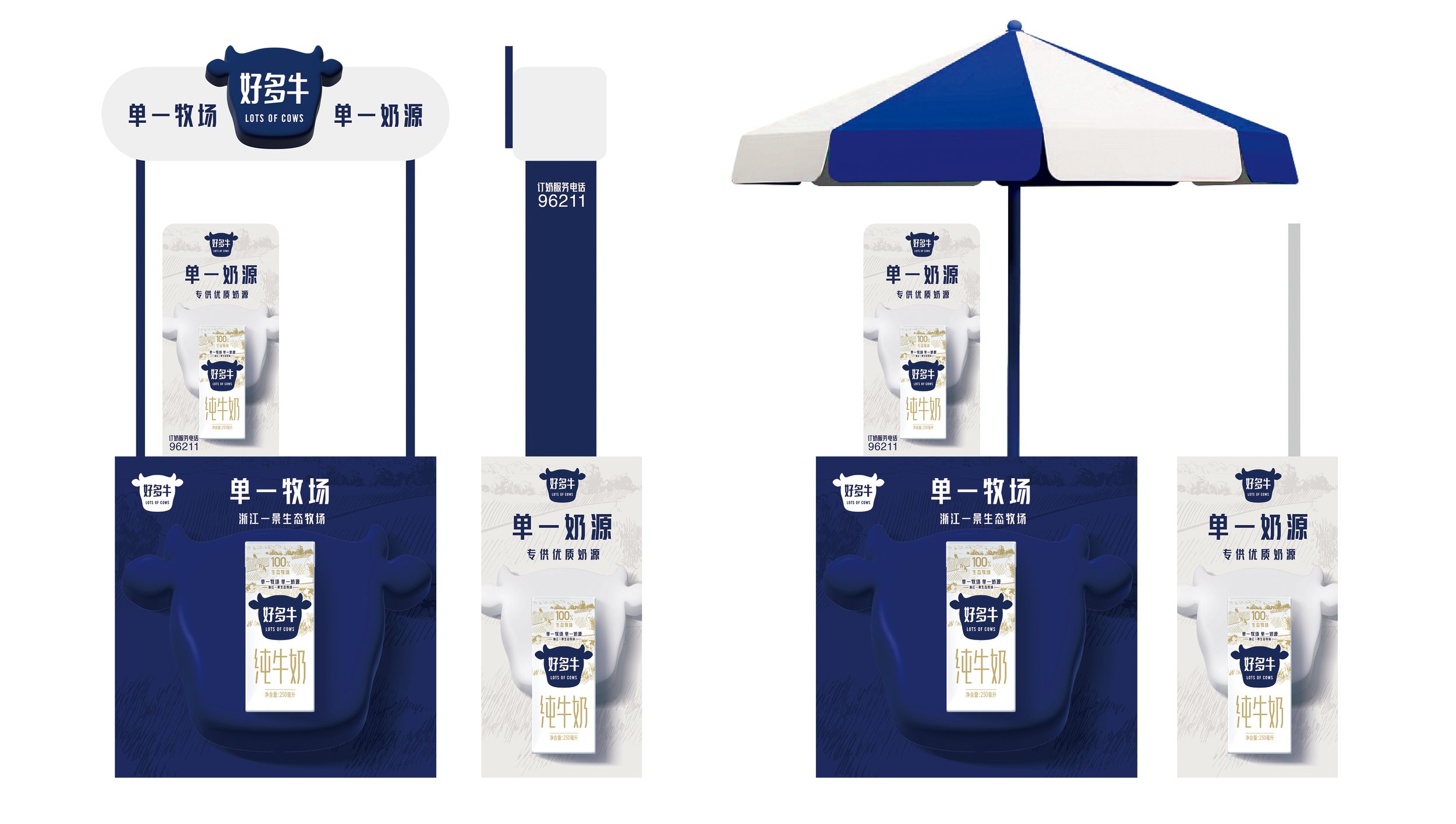
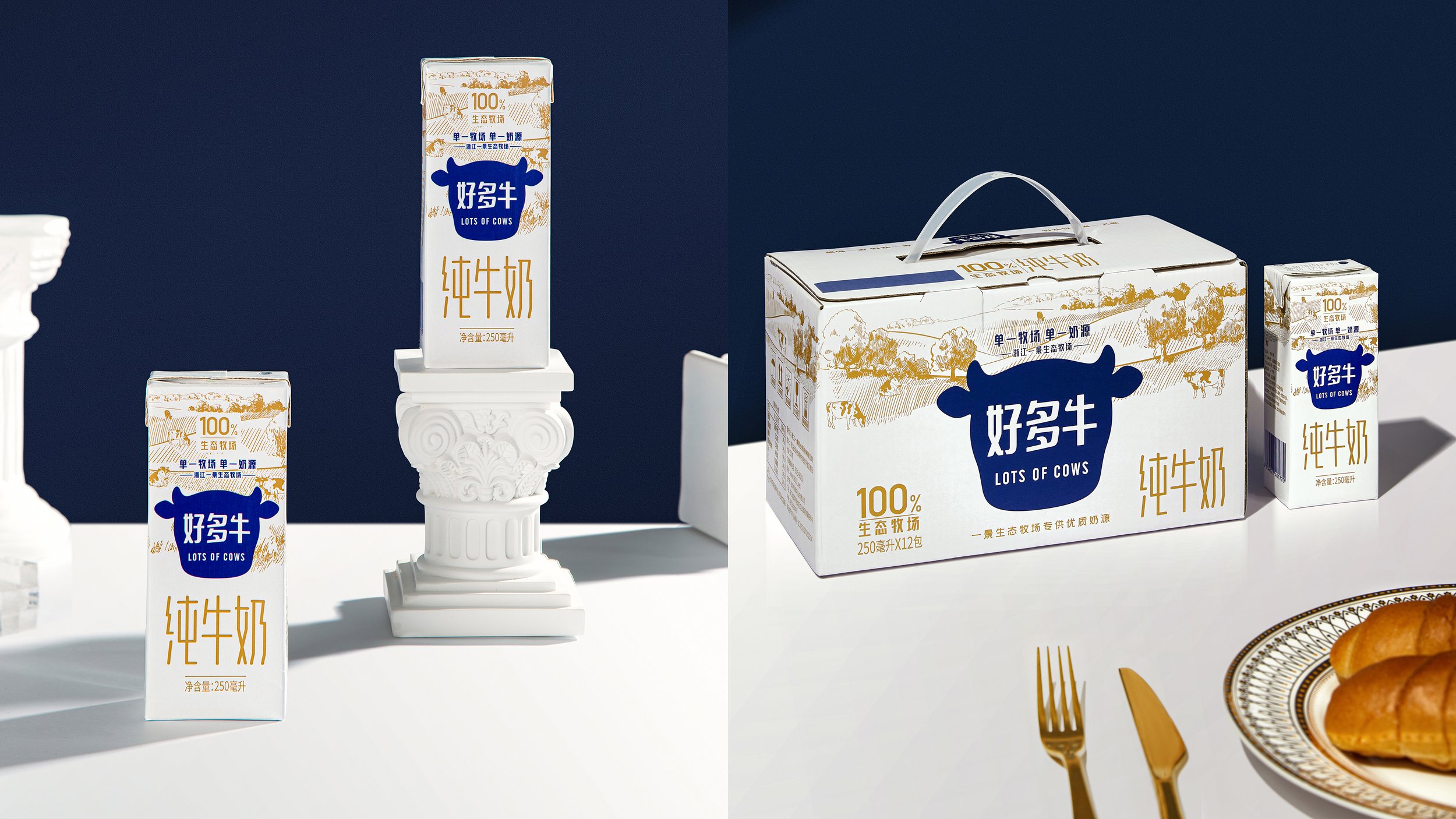
双色设计在节约成本的前提下,也满足产品”单一“的理念, 还能解决包装在货架上识别及醒目,整体以干净简洁的形象呈现给广大消费者。
Traditional milk companies need develop new forms and boundries. It puts thoughts and deliberation from details to the big picture. Designs should explain the simple concept, match market requirement. Inspiration always bring out more mature product and new design strategy.
After deep communication and digging ideas, we find"Lots of Cows"branding needs no maverick-- work on one thing and tell one story. "Single pasture, Single milk origin" is the key advantage YiJing Dairy.Compared to any other milk company, YiJing Dairy has high quality control of the milk origin.
Double color pattern can the save cost and explain the "Single" concept. This design out-stands the milk product from other products. Because consumers consider it's simple and clear.
